A key concept before explaining the classification indicators is how the process works. You have three data sets. They are training sets, validation sets, and test sets.
- Training set: Build a model using data from the training set. You, the model, learn from the inputs in this dataset.
- Verification set: There are several ways to get a validation set. An easy way to do this is to delete some of the data and use it as a validation set. Therefore, when you train the model, the model has not yet learned from the validation set. The validation set indicates the execution of your training set. You can also use the validation set to adjust the hyperparameters because you know the correct answer.
- Test set: Test sets are usually far behind data scientists. Testing our model in this step shows how well our model performs.
I created a random data frame in Jupyter Notebook. We are in the verification set. Our customers will provide us with a new data set (test set). Our goal is to get the best performance.
What does your performance mean?
I will demonstrate how our classification model measures performance. There are subtle differences in deciding how to measure performance. But first, let's create a data frame for 0 and 1.
We also need to know these definitions:
- True affirmation: The total number of accurate forecasts is “positive”. In our example, this is the total number of emails that are correctly predicted to be spam.
- False positive: The total number of inaccurate predictions for "affirmation". In our example, this is the total number of emails that were incorrectly predicted as spam.
- True negative: The total number of accurate predictions for "negation". In our example, this is the total number of correctly predicted emails that are not spam.
- False negative: The total number of inaccurate predictions for "negation". In our example, this is the total number of falsely predicted emails as non-spam.
In order to get a good visual effect of these indicators, we will use a confusion matrix. In Python, the sklearn library makes it easy to create confusing matrices.

If we look back at the definition:
- Real positive factor: 238
- False positive: 19
- True negation: 219
- False negative: 24
"This is great Alex, but I haven't discussed performance yet!"
correct. But we now have information to proceed. I will explain accuracy, precision, recall (sensitivity),F1Fraction, specificity, log loss andROC / AUCcurve.

accuracy
formula:
- Number of correct/predicted #
- (TP + TN)/(TP + FP + TN + FN)
Accuracy seems to be the best approach. In our case, our accuracy is 91.4%. The score is very high. So why not use it?
my thoughts:
- Accuracy is only valid if the two possible outcomes (whether the email is spam) are equal. For example, if we have a dataset where 5% email is spam, then we can follow a less complex model and get a higher accuracy score. We can predict each email as non-spam and get an 95% accuracy score. Unbalanced data sets can provide accuracy, not reliable performance metrics. The paradox of interpretation means Accuracy paradox ",
Precision/recall
These two performance metrics are often combined.
accurate
formula:
- TP /(TP + FP)
To be precise, we evaluate our data through the performance of “positive” forecasts. Our accuracy for the email example is 92.61%! Keep in mind that the "positive" in our example is predicting that email is spam.
Consider the accuracy of accurate positive predictions.
Recall (also known as sensitivity)
formula:
- TP /(TP + FN)
Through the recall, we evaluate our data through the performance of the basic facts of its positive outcomes. Means that when the result ispositiveWhen we judge the prediction aspositive. Our recall rate for email samples is 90.83%!
my thoughts:
- You can't have the best of both worlds. In our email example, we have high precision and recall scores. However, there is a need to weigh the pros and cons. Think about it. The denominator of precision is TP + FP. It does not consider FN. Therefore, if we only make a positive prediction and it is correct, then our exact score will be 1. However, we may have missed many actual positive observations.
- On the other hand, the denominator of Recall is TP + FN. It didn't see all the confidence predictions I made. We can predict that all emails are spam. Therefore, we rate Recall as 1 because we expect each example to be positive and our FN will be 0 (we don't predict non-spam).
In addition, it depends on whether you should use precision or recall. In some cases, you'd better use a high recall rate.
- If you mark each email as spam, 1 will be recalled. Why? Because you predict that email is spam. Since you don't predict that emails are not spam, you can't use fake negatives. However, you also incorrectly predict spam as non-spam.
- If you predict that an email is spam and you are doing it right, your accuracy will be 1. Why? Because there is no false positive. However, you will miss a lot of predictions.
There is also a less common performance indicator:Specificity.
Specificity is the opposite of Sensitivity or Recall. Therefore, the formula is TN /(TN + FP).
F1-score
formula:
- (2 * (precise * recall)) / (precise + recall)
F1-Score is a weighted average of accuracy and recall (Harmonic average). Our F1 score is 91.71%.
ROC curve / AUC score
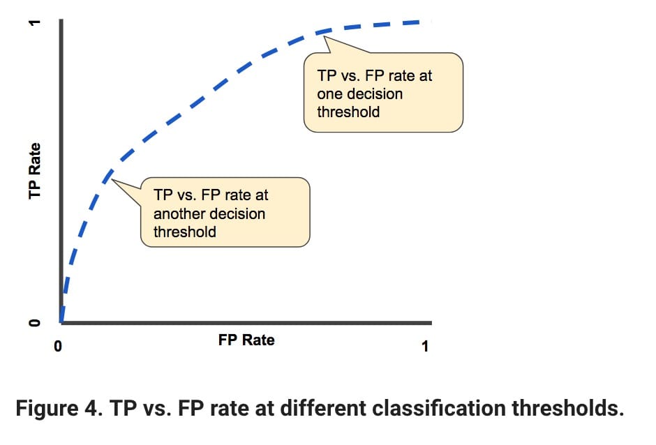
The ROC curve/AUC score is most useful when we evaluate the model. Let me explain. Our basic facts and predictions are 1 and 0. However, our prediction is never 1 or 0. Instead, we predict the probability and then evaluate whether it is 1 or 0. Typically, the classification threshold is .5 (in the middle). But we can have a better classification threshold.
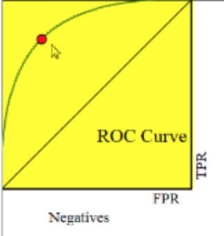
The indicators that our ROC curve focuses on are TPR (true positive rate) and FPR (false positive rate).
- True positive rate: TP / (TP + FN)
- False positive rate: FP / (FP + TN)

Our goal for ROC is to make the blue line in the image below as close as possible to the upper right part of the graph. On the other hand, the closer it is to the line, the worse the performance of our model. The red dot represents the trade-off between TPR and FPR.
- If you are dealing with cancer patients, getting a high TPR is more important than FPR. You want to accurately detect as many cancer patients as possible. It is not important that your false positive rate is high.
- If you need to keep the false positive rate low, assuming you don't want to be biased against some people, you must also accept a lower true positive rate.

AUC is the area under the curve. Therefore, it will be a number between 0 and 1. We hope it will be close to 1.
I know this example is useless when comparing models, but it's important to know!
Login loss
formula:
- – (Ylog(p)+(1-y)log(1-p))

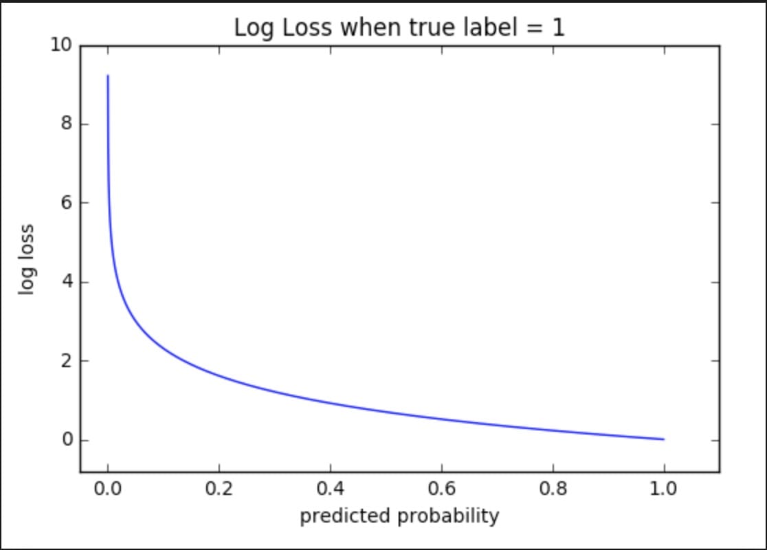
For logarithmic loss, we use the probability we predict.
Let's take a look at the chart above. Notice how it describes "real tag = 1". Well, this shows the basic facts. In addition, the slope of this number is significant. When the predicted probability is close to 0, our log loss increases exponentially. At the other end, the log loss is close to 0.
Intuition also applies to "real tags = 0", except that the chart is horizontally reflective, we see exponential growth to 1 instead of 0.
Now, it wants to evaluate the performance of each classification label (multiple classes) and each example, as follows:

in conclusion
I hope that you can visually understand these different performance metrics. Just work on a data science project at Kaggle to get a real understanding!


Comments