

Word嵌入是表示单词内容以及文档(单词集合)中包含的潜在信息的有效方式。使用新闻文章标题的数据集,其中包括关于来源,情感,主题和受欢迎程度(#份额)的特征,我开始通过各自的嵌入来了解我们可以了解文章之间的关系。
该项目的目标是:
- 使用NLTK预处理/清理文本数据
- 使用word2vec创建单词和标题嵌入,然后使用t-SNE将它们显示为簇
- 可视化标题情绪与文章流行度之间的关系
- 尝试从嵌入和其他可用功能预测文章流行度
- 使用模型堆叠来提高流行度模型的性能(此步骤不成功,但仍然是一个有价值的实验!)
进口和预处理
我们将从导入开始:
import pandas as pd
import gensim
import seaborn as sns
import matplotlib.pyplot as plt
import numpy as np
import xgboost as xgb
然后读入数据:
main_data = pd.read_csv('News_Final.csv')
main_data.head()
# Grab all the titles
article_titles = main_data['Title']
# Create a list of strings, one for each title
titles_list = [title for title in article_titles]

# Collapse the list of strings into a single long string for processing
big_title_string = ' '.join(titles_list)

from nltk.tokenize import word_tokenize

# Tokenize the string into words
tokens = word_tokenize(big_title_string)

# Remove non-alphabetic tokens, such as punctuation
words = [word.lower() for word in tokens if word.isalpha()]

# Filter out stopwords
from nltk.corpus import stopwords
stop_words = set(stopwords.words('english'))

words = [word for word in words if not word in stop_words]

# Print first 10 words
words[:10]接下来,我们需要加载预训练的word2vec模型。你可以在这里找到几个这样的模型。由于这是一个新闻数据集,我使用的是谷歌新闻模型,该模型经过大约1000亿字的培训(哇)。
# Load word2vec model (trained on an enormous Google corpus)
model = gensim.models.KeyedVectors.load_word2vec_format('GoogleNews-vectors-negative300.bin', binary = True)

# Check dimension of word vectors
model.vector_size
因此,模型将生成300维单词向量,而我们创建向量所需要做的就是将其传递给模型。每个向量看起来像这样:
economy_vec = model['economy']
economy_vec[:20] # First 20 components
word2vec(可以理解)不能从一个不在其词汇表中的单词创建一个向量。因此,我们需要在创建单词向量的完整列表时指定“if model in model.vocab”。
# Filter the list of vectors to include only those that Word2Vec has a vector for
vector_list = [model[word] for word in words if word in model.vocab]

# Create a list of the words corresponding to these vectors
words_filtered = [word for word in words if word in model.vocab]

# Zip the words together with their vector representations
word_vec_zip = zip(words_filtered, vector_list)

# Cast to a dict so we can turn it into a DataFrame
word_vec_dict = dict(word_vec_zip)
df = pd.DataFrame.from_dict(word_vec_dict, orient='index')
df.head(3)
使用t-SNE降低维数
接下来,我们将使用t-SNE压缩这些单词向量(读取:做降维),以查看是否出现任何模式。如果您不熟悉t-SNE及其解释,请查看这篇关于t-SNE的优秀互动性distill.pub文章。
使用t-SNE的参数非常重要,因为不同的值会产生非常不同的结果。我测试了0到100之间的几个值的困惑,并发现它每次产生大致相同的形状。我测试了20到400之间的几个学习率,并决定将学习率保持在默认值(200)。
为了可见性(和处理时间),我使用了400个单词向量而不是大约20,000个左右。
from sklearn.manifold import TSNE

# Initialize t-SNE
tsne = TSNE(n_components = 2, init = 'random', random_state = 10, perplexity = 100)

# Use only 400 rows to shorten processing time
tsne_df = tsne.fit_transform(df[:400])现在我们准备绘制减少的单词向量数组。我曾经adjust_text智能地将文字分开,以提高可读性:
sns.set()
# Initialize figure
fig, ax = plt.subplots(figsize = (11.7, 8.27))
sns.scatterplot(tsne_df[:, 0], tsne_df[:, 1], alpha = 0.5)

# Import adjustText, initialize list of texts
from adjustText import adjust_text
texts = []
words_to_plot = list(np.arange(0, 400, 10))

# Append words to list
for word in words_to_plot:
    texts.append(plt.text(tsne_df[word, 0], tsne_df[word, 1], df.index[word], fontsize = 14))

# Plot text using adjust_text (because overlapping text is hard to read)
adjust_text(texts, force_points = 0.4, force_text = 0.4,
            expand_points = (2,1), expand_text = (1,2),
            arrowprops = dict(arrowstyle = "-", color = 'black', lw = 0.5))

plt.show()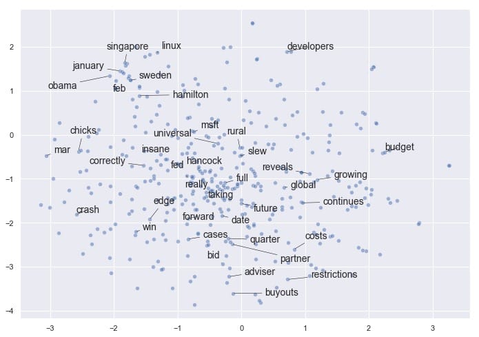
如果您有兴趣尝试adjust_text自己的绘图需求,可以在这里找到它。请务必使用camelcase导入它adjustText,请注意adjustText目前与matplotlib3.0或更高版本不兼容。
令人鼓舞的是,即使将矢量嵌入减少到2维,我们也会看到某些项聚集在一起。例如,我们在左/左上角有几个月,我们的企业融资条件接近底部,我们在中间有更多通用的非主题词(如“完整”,“真实”,“回转”)。
请注意,如果我们使用不同的参数再次运行t-SNE,我们可能会发现这个结果有一些相似之处,但我们不能保证看到完全相同的模式。t-SNE不是确定性的。相关地,簇的紧密度和簇之间的距离并不总是有意义的。它主要是作为一种探索性工具,而不是相似性的决定性指标。
平均词嵌入
我们已经了解了嵌入文字如何应用于此数据集。现在我们可以继续讨论一些更有趣的ML应用程序:找到聚集在一起的标题,并查看出现的模式。
我们可以使用更简单(有时甚至更有效)的技巧,而不是使用没有预训练模型的Doc2Vec,因此需要更长的训练过程:平均每个文档中单词向量的嵌入。在我们的例子中,文档是指标题。
我们需要重做预处理步骤以保持标题完整 – 正如我们将看到的,这比分裂单词更复杂。值得庆幸的是,Dimitris Spathis 创建了一系列功能,我发现这些功能可以完美地用于这个精确的用例。谢谢,迪米特里斯!
def document_vector(word2vec_model, doc):
    # remove out-of-vocabulary words
    doc = [word for word in doc if word in model.vocab]
    return np.mean(model[doc], axis=0)

# Our earlier preprocessing was done when we were dealing only with word vectors
# Here, we need each document to remain a document
def preprocess(text):
    text = text.lower()
    doc = word_tokenize(text)
    doc = [word for word in doc if word not in stop_words]
    doc = [word for word in doc if word.isalpha()]
    return doc

# Function that will help us drop documents that have no word vectors in word2vec
def has_vector_representation(word2vec_model, doc):
    """check if at least one word of the document is in the
    word2vec dictionary"""
    return not all(word not in word2vec_model.vocab for word in doc)

# Filter out documents
def filter_docs(corpus, texts, condition_on_doc):
    """
    Filter corpus and texts given the function condition_on_doc which takes a doc. The document doc is kept if condition_on_doc(doc) is true.
    """
    number_of_docs = len(corpus)

    if texts is not None:
        texts = [text for (text, doc) in zip(texts, corpus)
                 if condition_on_doc(doc)]

    corpus = [doc for doc in corpus if condition_on_doc(doc)]

    print("{} docs removed".format(number_of_docs - len(corpus)))

    return (corpus, texts)
现在我们将使用它们来进行处理:
# Preprocess the corpus
corpus = [preprocess(title) for title in titles_list]

# Remove docs that don't include any words in W2V's vocab
corpus, titles_list = filter_docs(corpus, titles_list, lambda doc: has_vector_representation(model, doc))

# Filter out any empty docs
corpus, titles_list = filter_docs(corpus, titles_list, lambda doc: (len(doc) != 0))
x = []
for doc in corpus: # append the vector for each document
    x.append(document_vector(model, doc))

X = np.array(x) # list to array
t-SNE,第2轮:文件向量
现在我们已经成功创建了我们的文档向量数组,让我们看看在使用t-SNE绘制它们时是否可以获得类似的有趣结果。
# Initialize t-SNE
tsne = TSNE(n_components = 2, init = 'random', random_state = 10, perplexity = 100)

# Again use only 400 rows to shorten processing time
tsne_df = tsne.fit_transform(X[:400])
fig, ax = plt.subplots(figsize = (14, 10))
sns.scatterplot(tsne_df[:, 0], tsne_df[:, 1], alpha = 0.5)

from adjustText import adjust_text
texts = []
titles_to_plot = list(np.arange(0, 400, 40)) # plots every 40th title in first 400 titles

# Append words to list
for title in titles_to_plot:
    texts.append(plt.text(tsne_df[title, 0], tsne_df[title, 1], titles_list[title], fontsize = 14))

# Plot text using adjust_text
adjust_text(texts, force_points = 0.4, force_text = 0.4,
            expand_points = (2,1), expand_text = (1,2),
            arrowprops = dict(arrowstyle = "-", color = 'black', lw = 0.5))

plt.show()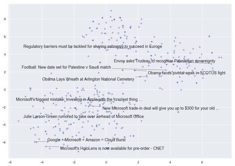
非常有趣!我们可以看到t-SNE已经将文档向量折叠成一个维度空间,文档根据其内容是否与国家,世界领导者和外交事务有关,或者与技术公司有更多关系而展开。
现在让我们探讨文章的受欢迎程度。共识认为,文章标题越耸人听闻或点击率越高,分享的可能性越大,对吧?接下来,我们将看看在这个特定的数据集中是否有证据表明。
人气和情感分析
首先,我们需要删除所有没有受欢迎度测量或来源的文章。用于流行度的空测量在该数据中表示为-1。
# Drop all the rows where the article popularities are unknown (this is only about 11% of the data)
main_data = main_data.drop(main_data[(main_data.Facebook == -1) |
                                     (main_data.GooglePlus == -1) |
                                     (main_data.LinkedIn == -1)].index)

# Also drop all rows where we don't know the source
main_data = main_data.drop(main_data[main_data['Source'].isna()].index)

main_data.shape
我们仍然有81,000篇文章可供使用,所以让我们看看我们是否能找到情绪和股票数量之间的关联。
fig, ax = plt.subplots(1, 3, figsize=(15, 10))

subplots = [a for a in ax]
platforms = ['Facebook', 'GooglePlus', 'LinkedIn']
colors = list(sns.husl_palette(10, h=.5)[1:4])

for platform, subplot, color in zip(platforms, subplots, colors):
    sns.scatterplot(x = main_data[platform], y = main_data['SentimentTitle'], ax=subplot, color=color)
    subplot.set_title(platform, fontsize=18)
    subplot.set_xlabel('')

fig.suptitle('Plot of Popularity (Shares) by Title Sentiment', fontsize=24)

plt.show()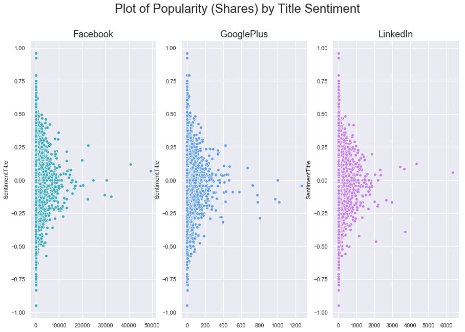
要弄清楚这里是否存在任何关系有点困难,因为一些文章在其份额方面是重要的异常值。让我们尝试对x轴进行对数转换,看看我们是否可以揭示任何模式。我们还将使用regplot,因此seaborn将覆盖每个图的线性回归。
# Our data has over 80,000 rows, so let's also subsample it to make the log-transformed scatterplot easier to read

subsample = main_data.sample(5000)

fig, ax = plt.subplots(1, 3, figsize=(15, 10))

subplots = [a for a in ax]

for platform, subplot, color in zip(platforms, subplots, colors):
    # Regression plot, so we can gauge the linear relationship
    sns.regplot(x = np.log(subsample[platform] + 1), y = subsample['SentimentTitle'],
                ax=subplot,
                color=color,
                # Pass an alpha value to regplot's scatterplot call
                scatter_kws={'alpha':0.5})

    # Set a nice title, get rid of x labels
    subplot.set_title(platform, fontsize=18)
    subplot.set_xlabel('')

fig.suptitle('Plot of log(Popularity) by Title Sentiment', fontsize=24)

plt.show()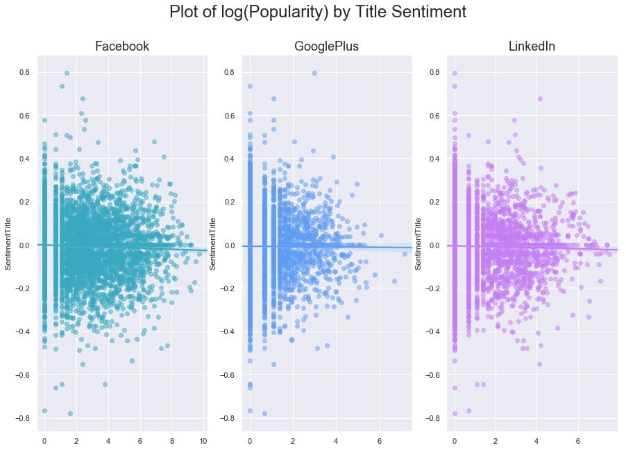
与我们可能期望的相反(来自我们对高度情绪化,点击率标题的看法),在这个数据集中,我们发现标题情绪与通过股票数量衡量的文章受欢迎程度之间没有关系。
为了更清楚地了解受欢迎程度如何看待自己,让我们按平台制作最终的日志(人气)。
fig, ax = plt.subplots(3, 1, figsize=(15, 10))

subplots = [a for a in ax]

for platform, subplot, color in zip(platforms, subplots, colors):

    sns.distplot(np.log(main_data[platform] + 1), ax=subplot, color=color, kde_kws={'shade':True})

    # Set a nice title, get rid of x labels
    subplot.set_title(platform, fontsize=18)
    subplot.set_xlabel('')

fig.suptitle('Plot of Popularity by Platform', fontsize=24)

plt.show()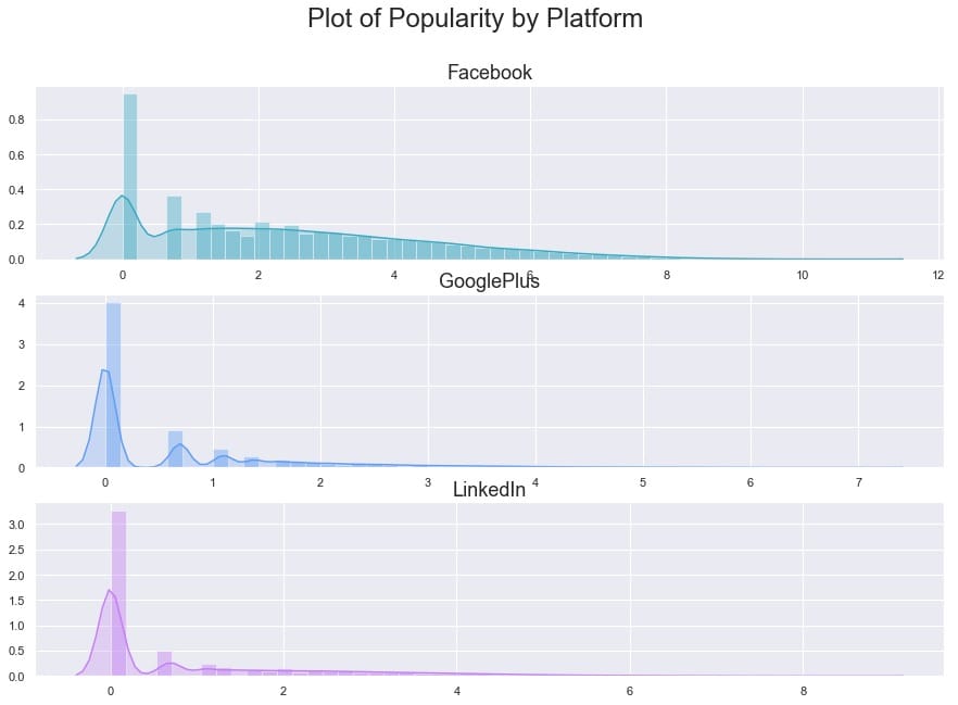
作为我们最后的探索部分,让我们来看看情绪本身。出版商之间似乎有所不同吗?
# Get the list of top 12 sources by number of articles
source_names = list(main_data['Source'].value_counts()[:12].index)
source_colors = list(sns.husl_palette(12, h=.5))

fig, ax = plt.subplots(4, 3, figsize=(20, 15), sharex=True, sharey=True)

ax = ax.flatten()
for ax, source, color in zip(ax, source_names, source_colors):
    sns.distplot(main_data.loc[main_data['Source'] == source]['SentimentTitle'],
                               ax=ax, color=color, kde_kws={'shade':True})
    ax.set_title(source, fontsize=14)
    ax.set_xlabel('')

plt.xlim(-0.75, 0.75)
plt.show()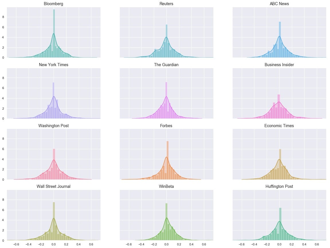
的分布看起来非常相似,但它是一个有点很难说如何相似时,他们都在不同的地块。让我们尝试将它们全部叠加在一个图上。
# Overlay each density curve on the same plot for closer comparison

fig, ax = plt.subplots(figsize=(12, 8))

for source, color in zip(source_names, source_colors):
    sns.distplot(main_data.loc[main_data['Source'] == source]['SentimentTitle'],
                               ax=ax, hist=False, label=source, color=color)
    ax.set_xlabel('')

plt.xlim(-0.75, 0.75)
plt.show()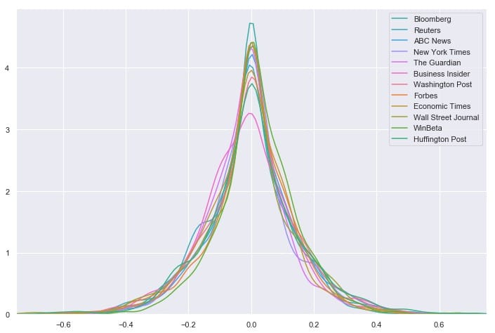
我们看到消息来源对文章标题的情感分布非常相似 – 看起来任何一个来源都不是正面或负面标题的异常值。相反,所有12个最常见的源都具有以0为中心的分布,具有适度大小的尾部。但是这能说出完整的故事吗?让我们再看一下这些数字:
# Group by Source, then get descriptive statistics for title sentiment
source_info = main_data.groupby('Source')['SentimentTitle'].describe()
# Recall that `source_names` contains the top 12 sources
# We'll also sort by highest standard deviation
source_info.loc[source_names].sort_values('std', ascending=False)[['std', 'min', 'max']]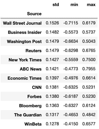
我们可以一眼看出,华尔街日报的标准差最大,范围最大,与其他任何顶级资源相比,最低情绪最低。这表明华尔街日报在文章标题方面可能异常负面。要严格验证这一点需要进行假设检验,这超出了本文的范围,但这是一个有趣的潜在发现和未来方向。
人气预测
我们为建模数据准备的第一个任务是重新加入带有各自标题的文档向量。值得庆幸的是,当我们在预处理语料,我们处理corpus和titles_list同步,所以他们所代表的载体和标题仍将匹配。与此同时,main_df我们已经删除了所有具有-1流行度的文章,因此我们需要删除代表这些文章标题的向量。
在这台计算机上不可能对这些巨大的载体进行模型训练,但我们会看到通过减少一点维度可以做些什么。我还将根据发布日期设计一个新功能:“DaysSinceEpoch”,它基于Unix时间(在此处阅读更多内容)。
import datetime

# Convert publish date column to make it compatible with other datetime objects

main_data['PublishDate'] = pd.to_datetime(main_data['PublishDate'])

# Time since Linux Epoch
t = datetime.datetime(1970, 1, 1)

# Subtract this time from each article's publish date
main_data['TimeSinceEpoch'] = main_data['PublishDate'] - t

# Create another column for just the days from the timedelta objects
main_data['DaysSinceEpoch'] = main_data['TimeSinceEpoch'].astype('timedelta64[D]')

main_data['TimeSinceEpoch'].describe()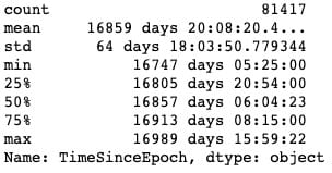
正如我们所看到的,所有这些文章都是在彼此约250天内发布的。
from sklearn.decomposition import PCA

pca = PCA(n_components=15, random_state=10)

# as a reminder, x is the array with our 300-dimensional vectors
reduced_vecs = pca.fit_transform(x)
df_w_vectors = pd.DataFrame(reduced_vecs)

df_w_vectors['Title'] = titles_list
# Use pd.concat to match original titles with their vectors
main_w_vectors = pd.concat((df_w_vectors, main_data), axis=1)

# Get rid of vectors that couldn't be matched with the main_df
main_w_vectors.dropna(axis=0, inplace=True)现在我们需要删除非数字和非虚拟列,以便我们可以将数据提供给模型。我们还将对该DaysSinceEpoch特征应用缩放,因为与减少的单词向量,情绪等相比,它的幅度要大得多。
# Drop all non-numeric, non-dummy columns, for feeding into the models
cols_to_drop = ['IDLink', 'Title', 'TimeSinceEpoch', 'Headline', 'PublishDate', 'Source']

data_only_df = pd.get_dummies(main_w_vectors, columns = ['Topic']).drop(columns=cols_to_drop)

# Standardize DaysSinceEpoch since the raw numbers are larger in magnitude
from sklearn.preprocessing import StandardScaler

scaler = StandardScaler()

# Reshape so we can feed the column to the scaler
standardized_days = np.array(data_only_df['DaysSinceEpoch']).reshape(-1, 1)
data_only_df['StandardizedDays'] = scaler.fit_transform(standardized_days)

# Drop the raw column; we don't need it anymore
data_only_df.drop(columns=['DaysSinceEpoch'], inplace=True)

# Look at the new range
data_only_df['StandardizedDays'].describe()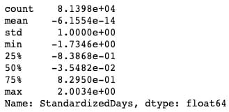
# Get Facebook data only
fb_data_only_df = data_only_df.drop(columns=['GooglePlus', 'LinkedIn'])
# Separate the features and the response
X = fb_data_only_df.drop('Facebook', axis=1)
y = fb_data_only_df['Facebook']

# 80% of data goes to training
X_train, X_test, y_train, y_test = train_test_split(X, y, test_size = 0.2, random_state = 10)让我们XGBoost对数据进行非优化,看看它是如何开箱即用的。
from sklearn.metrics import mean_squared_error

# Instantiate an XGBRegressor
xgr = xgb.XGBRegressor(random_state=2)

# Fit the classifier to the training set
xgr.fit(X_train, y_train)

y_pred = xgr.predict(X_test)

mean_squared_error(y_test, y_pred)至少可以说,结果并不令人满意。我们可以通过超参数调整来改善这种性能吗?我已经从这篇Kaggle文章中提取并重新调整了一个超参数调整网格。
from sklearn.model_selection import GridSearchCV

# Various hyper-parameters to tune
xgb1 = xgb.XGBRegressor()
parameters = {'nthread':[4],
              'objective':['reg:linear'],
              'learning_rate': [.03, 0.05, .07],
              'max_depth': [5, 6, 7],
              'min_child_weight': [4],
              'silent': [1],
              'subsample': [0.7],
              'colsample_bytree': [0.7],
              'n_estimators': [250]}

xgb_grid = GridSearchCV(xgb1,
                        parameters,
                        cv = 2,
                        n_jobs = 5,
                        verbose=True)

xgb_grid.fit(X_train, y_train)据xgb_grid我们所知,我们的最佳参数如下:
{'colsample_bytree':0.7,'learning_rate':0.03,'max_depth':5,'min_child_weight':4,'n_estimators':250,'nthread':4,'objective':'reg:linear','silent' :1,'subsample':0.7}使用新参数再试一次:
params = {'colsample_bytree': 0.7, 'learning_rate': 0.03, 'max_depth': 5, 'min_child_weight': 4,
          'n_estimators': 250, 'nthread': 4, 'objective': 'reg:linear', 'silent': 1, 'subsample': 0.7}

# Try again with new params
xgr = xgb.XGBRegressor(random_state=2, **params)

# Fit the classifier to the training set
xgr.fit(X_train, y_train)

y_pred = xgr.predict(X_test)

mean_squared_error(y_test, y_pred)
它大约35,000更好,但我不确定是说了很多。在这一点上,我们可能推断出当前状态下的数据似乎不足以使该模型执行。让我们看看我们是否可以通过更多的特征工程来改进它:我们将训练一些分类器来分离两组主要文章:Duds(0或1份)与Not Duds。
我们的想法是,如果我们能给回归量一个新的特征(该文章具有极低的份额的可能性),它可能更有利于预测高度共享的文章,从而降低这些文章的残值并减少均方。错误。
绕道:检测无用品
从我们之前制作的对数转换图中,我们可以注意到,一般来说,有2个文章块:1个簇在0,另一个簇(长尾)从1开始。我们可以训练一些分类器来识别文章是否是“哑弹”(在0-1股票箱中),然后使用这些模型的预测作为最终回归量的特征,这将预测概率。这称为模型堆叠。
# Define a quick function that will return 1 (true) if the article has 0-1 share(s)
def dud_finder(popularity):
    if popularity <= 1:
        return 1
    else:
        return 0
# Create target column using the function
fb_data_only_df['is_dud'] = fb_data_only_df['Facebook'].apply(dud_finder)
fb_data_only_df[['Facebook', 'is_dud']].head()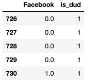
# 28% of articles can be classified as "duds"
fb_data_only_df['is_dud'].sum() / len(fb_data_only_df)
现在我们已经完成了dud功能,我们将初始化分类器。我们将使用随机森林,优化的XGBC分类器和K-Nearest Neighbors分类器。我将省略调整XGB的部分,因为它看起来与我们之前做的调整基本相同。
from sklearn.ensemble import RandomForestClassifier
from sklearn.neighbors import KNeighborsClassifier
from sklearn.model_selection import train_test_split
X = fb_data_only_df.drop(['is_dud', 'Facebook'], axis=1)
y = fb_data_only_df['is_dud']
# 80% of data goes to training
X_train, X_test, y_train, y_test = train_test_split(X, y, test_size = 0.2, random_state = 10)
# Best params, produced by HP tuning
params = {'colsample_bytree': 0.7, 'learning_rate': 0.03, 'max_depth': 5, 'min_child_weight': 4,
          'n_estimators': 200, 'nthread': 4, 'silent': 1, 'subsample': 0.7}
# Try xgc again with new params
xgc = xgb.XGBClassifier(random_state=10, **params)
rfc = RandomForestClassifier(n_estimators=100, random_state=10)
knn = KNeighborsClassifier()
preds = {}
for model_name, model in zip(['XGClassifier', 'RandomForestClassifier', 'KNearestNeighbors'], [xgc, rfc, knn]):
    model.fit(X_train, y_train)
    preds[model_name] = model.predict(X_test)
测试模型,获取分类报告:
from sklearn.metrics import classification_report, roc_curve, roc_auc_score
for k in preds:
    print("{} performance:".format(k))
    print()
    print(classification_report(y_test, preds[k]), sep='\n')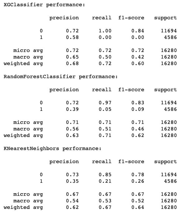
f1-score的最高表现来自XGC,其次是RF,最后是KNN。但是,我们也可以注意到,KNN 在召回方面确实做得最好(成功识别哑弹)。这就是为什么模型堆叠是有价值的 – 有时甚至像XGBoost这样的优秀模型也会在像这样的任务上表现不佳,显然要识别的功能可以在本地近似。包括KNN的预测应该增加一些急需的多样性。
# Plot ROC curves
for model in [xgc, rfc, knn]:
    fpr, tpr, thresholds = roc_curve(y_test, model.predict_proba(X_test)[:,1])
    plt.plot([0, 1], [0, 1], 'k--')
    plt.plot(fpr, tpr)

plt.xlabel('False Positive Rate')
plt.ylabel('True Positive Rate')
plt.title('ROC Curves')
plt.show()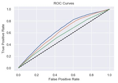
人气预测:第2轮
现在我们可以从三个分类器中平均出概率预测,并将其用作回归量的特征。
averaged_probs =(xgc.predict_proba(X)[:,1] +
                  knn.predict_proba(X)[:,1] +
                  rfc.predict_proba(X)[:,1])/ 3
X ['prob_dud'] = averaged_probs
y = fb_data_only_df ['Facebook']
接下来是另一轮惠普调整,包括新功能,我将遗漏。让我们看看我们如何处理性能:
xgr = xgb.XGBRegressor(random_state=2, **params)
# Fit the classifier to the training set
xgr.fit(X_train, y_train)
y_pred = xgr.predict(X_test)
mean_squared_error(y_test, y_pred)
哦哦!这种性能与我们甚至进行任何模型堆叠之前的性能基本相同。也就是说,我们可以记住,MSE作为误差测量倾向于超重异常值。实际上,我们还可以计算平均绝对误差(MAE),用于评估具有显着异常值的数据的性能。在数学术语中,MAE计算残差的l1范数,基本上是绝对值,而不是MSE使用的l2范数。我们可以将MAE与MSE的平方根进行比较,也称为均方根误差(RMSE)。
mean_absolute_error(y_test,y_pred),np.sqrt(mean_squared_error(y_test,y_pred))
平均绝对误差仅为RMSE的1/3左右!也许我们的模型并不像我们最初想的那么糟糕。
最后一步,让我们根据XGRegressor了解每个功能的重要性:
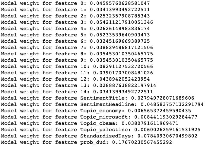
整齐!我们的模型被发现prob_dud是最重要的功能,我们的自定义StandardizedDays功能是第二重要的功能。(特征0到14对应于缩小的标题嵌入向量。)
尽管通过这一轮模型堆叠没有改善整体性能,但我们可以看到我们成功地捕获了数据的一个重要变异来源,模型已经开始了。
如果我要继续扩展这个项目以使模型更准确,我可能会考虑使用外部数据来增加数据,包括通过分箱或散列将Source作为变量,在原始300维向量上运行模型,以及使用每个文章在不同时间点的流行度的“时间分片”数据(该数据的伴随数据集)来预测最终流行度。
如果您发现此分析很有趣,请随时使用该代码,并进一步扩展它!笔记本在这里(请注意,某些单元格的顺序可能与此处显示的顺序略有不同),此项目使用的原始数据在此处。

Comments